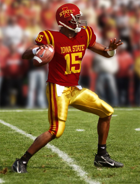
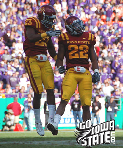
Director of Athletics, Jamie Pollard, unveiled a new graphics identity for the Iowa State athletic programs at a press conference earlier today. He also showed off the new home and away uniforms and helmets the football team will wear during the 2008 season.
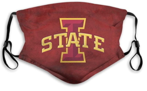
When I heard the news that Iowa State would be announcing a new graphics identity at the press conference, I had a pretty good feeling the I STATE logo was going to be picked. The I STATE logo was the only logo of the three that would work as a graphics identity. The ISU logo was pretty basic and the cursive Cyclones was pretty weak. I look forward to seeing the I STATE logo in the middle of the football field and at mid-court for basketball. It will also look sharp on the wrestling singlets.
If the I STATE logo was going to be the new graphics identity for the athletic program, it only stands to reason that the new logo would be on the new helmets too.
The curveball of the press conference was when Jamie announced the new helmet wouldn’t be white but cardinal. The fans spoke out against the white helmets that were originally proposed and the athletic department listened. The cardinal helmet looks better with the uniforms, but the new mark would have stood out better on a white helmet. I would recommend one tweak to the helmet – change the facemask from gray to gold or white.
The uniform choices are great. I really like IOWA STATE in bold letters across the chest and the piping around the shoulders. The road unis definitely look better with the cardinal pants.
The best thing about the new uniforms, helmet and logo -they are CARDINAL and GOLD – Iowa State’s school colors.
It is time for the Iowa State fan base to rally around the new look of the athletic programs. The new identity has been chosen and it isn’t going to change in the near future. I urge all Cyclone fans to embrace the changes whether you like them or not.


